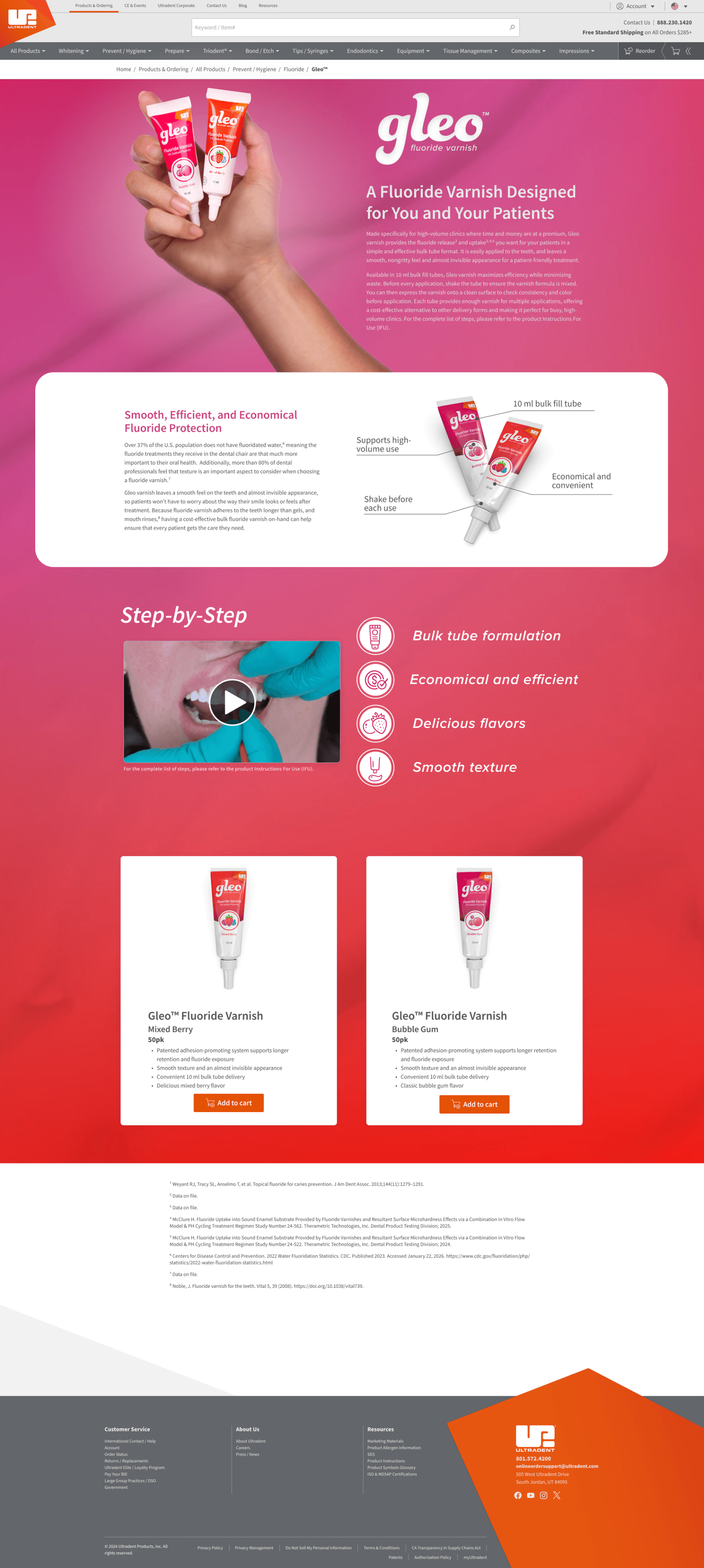
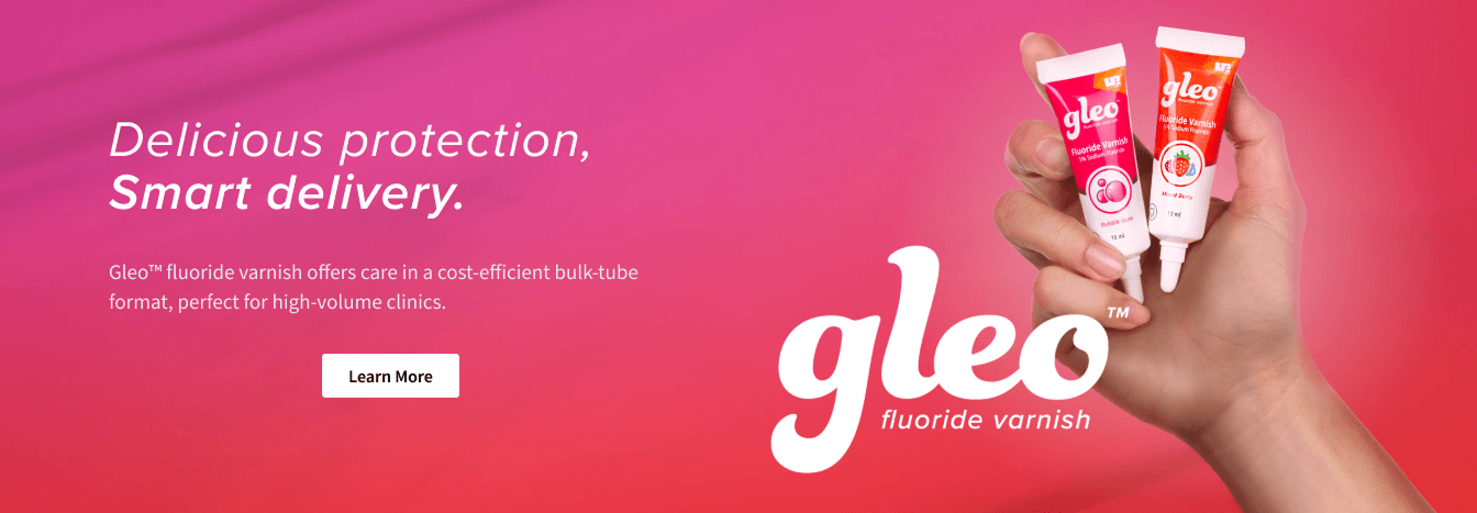
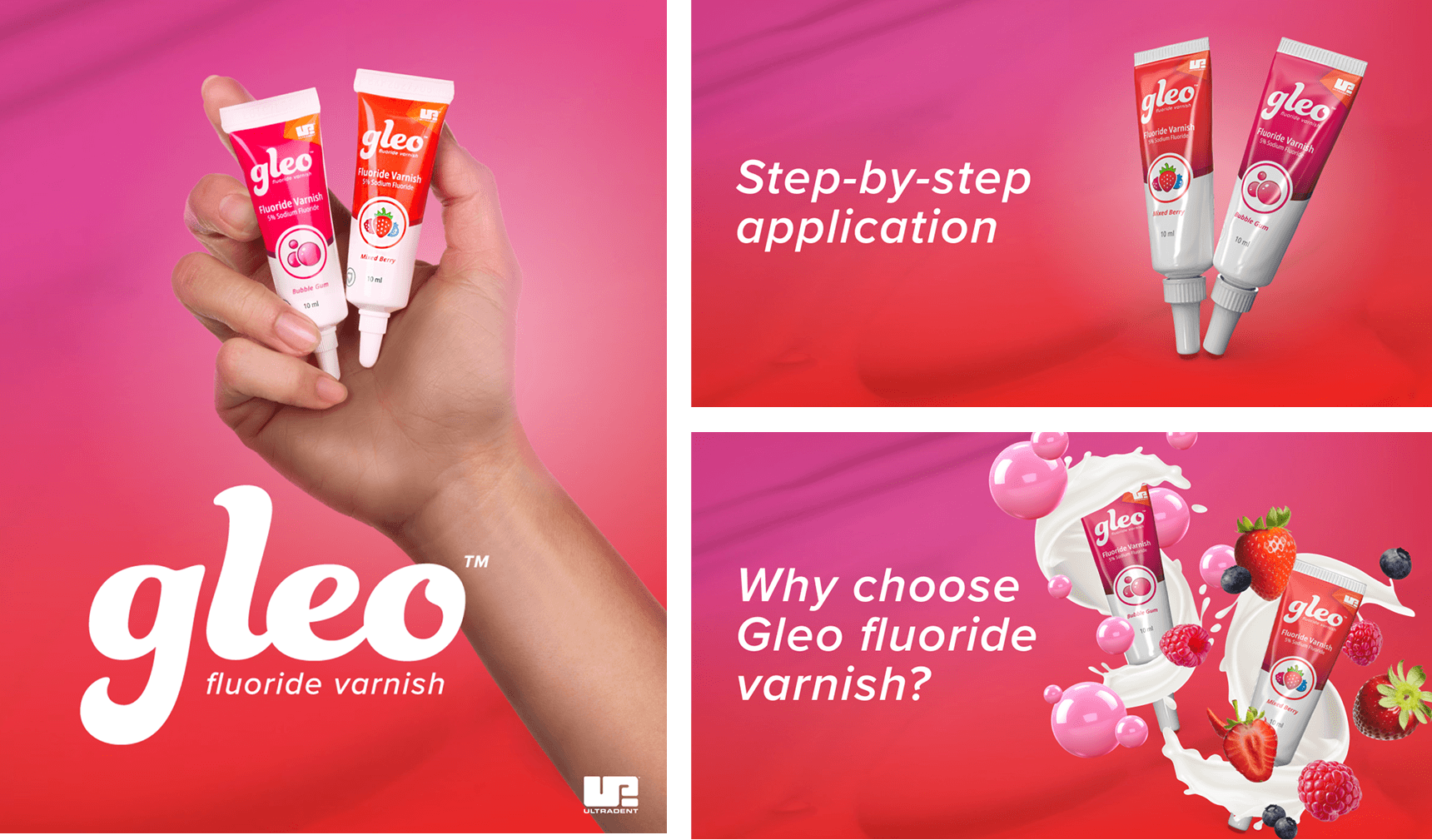
As Art Director for the Gleo campaign launch, I led the creative development of a new fluoride varnish brand built for budget-conscious dental settings. With no existing brand guide in place, I directed the digital design team in shaping Gleo's visual identity, guiding the development of a vibrant color palette and packaging system that set it apart in a competitive market while signaling the trusted clinical quality its manufacturer is known for. I translated a positioning rooted in three core attributes (trusted, economical, and patient-friendly) into a cohesive look and tone that felt friendly, professional, and reassuring. Throughout the project, I balanced bold, appealing design with strict regulatory and messaging guardrails, ensuring every asset communicated affordability and clinical confidence without overstating product claims. The result was a distinctive brand presence that positioned Gleo as a quality varnish at an accessible price.
Role
Art Director